First of all: Everything in this blogpost is just my personal opinion. I am not a developer of KDE System Settings. I am also not a designer or usability-expert, so please just read this as a collection of subjective, personal impressions. Of course I am willing to help if I can 🙂
Recently, I installed KDE on a friend’s computer. As always when I install Linux for someone who never used it before (just saw it on my computer) I let him play with the desktop environment, without giving any advice and without showing what you can do with KDE. (and to be honest, I always enjoy this moment!) He was impressed by the overall speed and the possibility to customize everything (although it took some time to understand how the widget system works). But in this case he also made one experience which bothered me too for a very long time and which lead to this post: The System Settings of KDE are a horror to use for new, non-technical users. Please let me explain why.
The problems
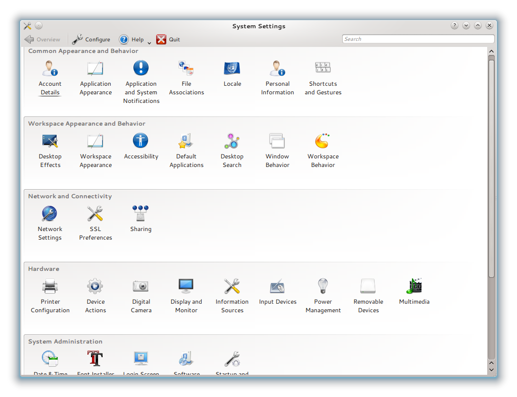
Let’s start with this first thing people see when running “systemsettings”:
You see a bunch of icons, categorized into “Common Appearance and Behavior”, “Workspace Appearance and Behavior”, “Network”, “Hardware” and “System Administration”. And the problems to new, non-technical users start right here: What is the difference between “Common” and “Workspace” behavior? For all users, the workspace and all applications are the “common” thing, so they can’t see the difference. (For developers, of course, this is obvious)
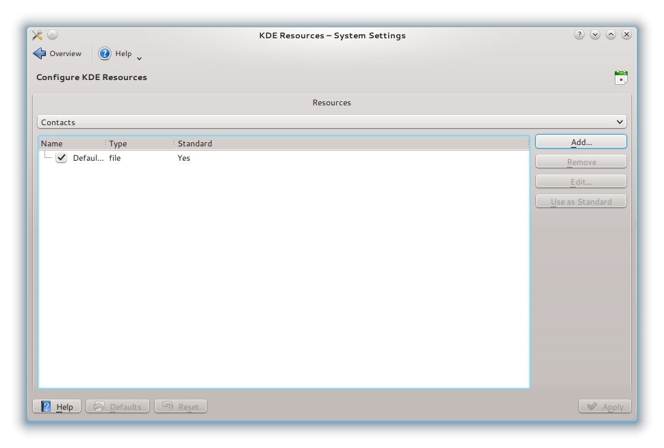
Second thing: Why are “Account Details” and “Personal Information” in the “Common Appearance & Behavior” section, when they have nothing to do with behavior or appearance? And what is the difference between “Personal Information” and “Account Details” anyway? Well, let’s open the “Personal Information” setting, because I want to change my e-mail address, which is a personal information, right?
Oh… Technically, it is sane to put the personal resources under “Personal Information”, but this is not what users expect. Also, did you recognize that “Personal Information” and “Account Details” have the same icon? How should users see the difference? This “same icon problem” is also present in the two modules which control appearance:
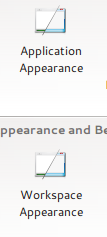 This might look as a very, very small issue, but it is a very bad thing for what people call “user experience”. Why do we have “Workspace Behavior” and “Application Behavior” anyway? Users open the system settings with something like a mission, e.g. “I want to change the look of my desktop” – while it’s technically correct to separate between applications and the workspace itself, users don’t care about these details.
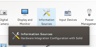
Let’s go down the System Settings page and take a look at the hardware section: You’ll find an entry “Information Sources” there. What the hell are “information sources”? To provide some more information, the System Settings provide tooltips to help users find what they need or to explain something:
Oh cool! “Hardware Integration Configuration with Solid” – While all people developing stuff for KDE of course know what Solid is, users really don’t know and don’t want to know it, which makes this tooltip a pretty useless information. If you open the “Information Sources” module, you also get stuff to see which is not useful for the average, non-technical user. So in the end, this entry for example should be hidden by default. Also, no user know what “Phonon” is and what backends are for. All these settings, including options to change user’s $HOME path for example, are not relevant for end users. They just want a working system and might do small modifications, and they don’t want to be confused by many strange-looking settings if they just want to change their desktop design. It is extremely hard to find the particular setting you are looking for, if it is hidden by thousand other settings you can apply.
As you can see, there are four main-areas where KDE’s System Settings are a problem to new, non-technical users:
- The settings are crowded and it’s difficult to find stuff you change often between settings you probably never (want to) touch.
- Some sections have confusing names
- The separation of settings is confusing: Stuff which belongs together is separated, and some stuff is together which should be separated.
- Technical terms are still used in the settings
- (Icons are the same for some stuff)
Let’s do something weird…
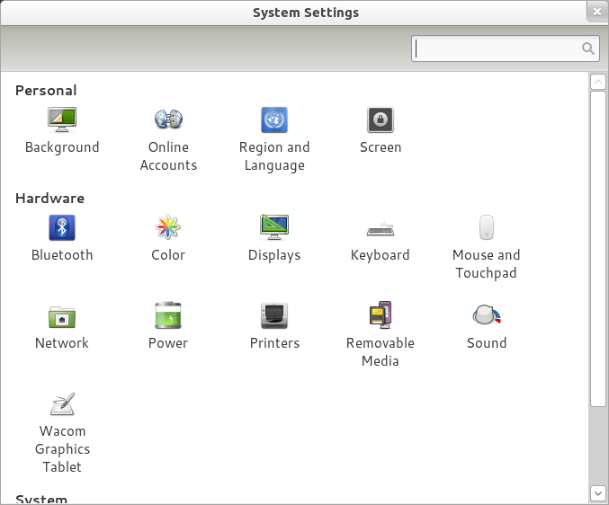
…and look at what the GNOME folks did:
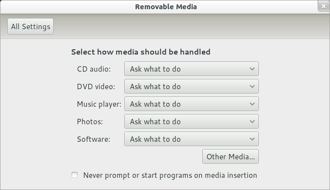
The first thing you can see is that they copied the layout KDE already used :P. You can also see that they show only very few modules by default, separated into only three categories: “Personal”, “Hardware” and “System” This makes it very easy for new users to find the stuff they want. Also, you don’t see technical details here, e.g. if you click on the “Sound” button, you won’t find a single word about PulseAudio. Also, they don’t show many settings, they pick good defaults which fit for most users and show a settings UI for the stuff which most users want to change (e.g. the Background, Passwords or Sounds) There is no chance that users get lost in too many settings.
The solution…
…is of course not to copy what GNOME did! 🙂 As much as I like their approach of making settings simple for new users, it also brings many disadvantages. The biggest problem is that users who want to customized their GNOME desktop a little bit more than the GNOME devs think it is necessary, have to dig into config files and the DConf system – and this definitely can’t be the solution since we want to create a great desktop for beginners as well as for professional users and for people who want to customize everything. So we should not remove useful settings. Certainly there are thinks some people want to to change where others think this setting is useless because they never changed it.
So, what should we do instead? First of all, pick good defaults. The best settings are the ones you never want to change because they are already set to a good default value. Finding these defaults is hard (meaning some user-surveys), but in the end the overall experience is better.
I would also like to propose two modes for the System Settings: One “Basic Mode”, doing something similar than the GNOME Control Center by just showing essential elements and stuff which is changed often, and one “Advanced Mode”, showing all settings. We already have “Settings for the Settings” (which is also a strange thing :P), so adding this to the UI shouldn’t be a problem. (It might break the control module API, because each module would have to check if it is running in advanced mode or not, so this might be something for KDE5) – Of course this is just a suggestion which I find useful, but there might be reasons against doing it 😛
For all the other stuff, there really needs to be a discussion about how to group the settings and maintainers of control modules need to look how they can improve the user experience. A very good example is the Power Management module, which got a much better UI recently.

I agree completely with your points concerning the useability of the System Settings UI. However, I don’t think that a separation into a “basic” and an “advanced” mode is the best solution. IMHO, this approach carries the danger of making it even harder for users to find what they are looking for: By hiding stuff it reduces the discoverability of settings that the developers – for more or less arbitrary reasons – considered to be “advanced”. IIRC, we even had something similar (albeit with more limited functionality) already.
Personally, I would much rather just have better categorization and descritptions of modules together with some splitting and merging where it makes sense. If we also spend time thinking about how individual modules should present their options, we should be able to get to a point where one mode fits all.
Yes, I heard this argument before from a GNOME dev – I’m not sure if this is true, because if “advanced” and “basic” is done right, there shouldn’t be much confusion. But I completely agree with you that trying to make it better without using the advanced approach is the better choice. (It avoids the problems and discussions an advanced mode would produce, and if we can do something good without it, it’s not needed. – I just don’t know if this is possible, but we can easily find this out 😛 )
There is no way to do the basic/advanced dichotomy “right”.
(1) There is no clear dividing line between what is advanced and what is basic, at the very least, the advanced settings for a given module should be reachable from within that module, so that if the user doesn’t see what he wants he can click “more”.
(2) Often (usually) working out how to present settings is difficult. It requires thought to get it right, and doing so forces the designer/developer/hacker/software -scientist to think carefully about how the user is going to understand and interact with her software. This leads to good design (hopefully). The temptation once you have basic and advanced modes is to think “basic doesn’t need to have the features and advanced doesn’t need to be nice to use” the result is neither interface is elegant or powerful and you don’t make the developer think so carefully about how the user thinks about the software.
For an example of the horror of this approach, look at the VLC settings dialogue.
Personally I use the search box or search directly in KRunner for the settings module I need to use, looking manually though a menu or grid of icons is so last century. So I just want the search to be better or at least no worse.
Windows 7 Control Panel quite nicely lays-out settings with parent modules as headings and sub-modules underneath them. If you filter down the list more relevant sub-modules will appear. – I have just experimented with this and it appears to do more than just “filter” the list according to the search: It appears to be more of a Bayesian (search match score)*(module weighting) thing .
I agree in most things you say but check this:
http://forum.kde.org/brainstorm.php#idea97608_page1
Please stop hiding configuration option. Gnome has been able to have something simple for only one reasons. It is not possible to configure anything.
Clarify it, rationalize it ok but do not remove the possibility to configure KDE exactly like you want.
I’m not suggesting to remove options from KDE. (that would be really bad, IMHO)
And in GNOME options aren’t removed too, there’s just no GUI config tool for most of the things. (which is similar to removing a option, but not the same)
Good points. I think however, that there is more change in getting it changed by opening bug reports at http://bugs.kde.org This blog might be read now, but in a couple of days it will be forgotten, while bug reports remain open and keep on showing on the developers lists with things to do.
Open a bug reports for each issue that you mentioned (the icons, the naming of things, etc). That way things can be worked on by different people and makes it possible to really close a bug. I really hope that you’ll open bug reports to obtain a better user experience! Refer in the bug reports to this blog post and to the forum discussion mentioned above.
Of course bug reports are the way to go here and I’ll file them as soon as possible. But the Planet is a great place to raise awareness for a specific issue, and this affects not only the System Settings but also other parts of KDE.
I was involved in a discussion about the same thing ones. Demotivated me so much I never recovered.
https://bugs.kde.org/show_bug.cgi?id=157587
You are 100% right.
Have a look at how Microsoft does it. I think they do a superb job for ‘the non-techies. They have expert-view too, which I never use anymore cause they searchfuncties does the job so well (and the expertview suffers from the same as System Settings):http://4.bp.blogspot.com/_Rf56AL-pm3Y/TFA8YJ-VgKI/AAAAAAAAGdU/tIRYVP1gfXU/s1600/share-internet-connection-2.png
Totally agree with this: sane defaults + simple configuration options, and advanced options for those more technically inclined, making getting stuff done easier but at the same time not taking away options…
This actually reminds me of an april 1 joke from a few years ago where a basic and advanced mode of kde were announced (http://dot.kde.org/2010/04/01/announcing-upcoming-release-new-customized-kde-software-compilations), which oddly I thought was actually a good idea (though obviously that post does take it to extremes :p).
As a non-developer it’s easy to comment on stuff you’d like without knowing how easy/hard it is to implement but there is some stuff I’d rather not see the configuration options for by default, as they can be confusing for new users:
– akonadi (just an “accounts” option in which I can enter account information (eg: facebook, gmail, IMAP) rather than these “resources” would be easier). Also (when using kde telepathy) why is there a “personal information” tab for akonadi resources and “instant messaging and VoIP” for IM accounts?
– Nepomuk/Strigi: when clicking Desktop Search you end up in Nepomuk/Strigi Server configuration… Nepowhat?
I’m not complaining about offering these options, just saying they can easily confuse new users, so they would be ideal candidates for being hidden in an advanced menu…
All the new people I know who go to kde, which are among the critical one is the confusion that exists in systemsetting.I hope really a better rationalization for the future, it would be important
Completely agree. SytemSettings needs a more newbie friendly interface without renouncing to “under the hood” options for experienced kde users.
I consider myself quite a power user. I know quite well the underlying technologies and their interconnections. But when I open system settings, I almost always end up using the search instead of navigation (although I’d prefer latter), because I just can’t figure out where is the thing I want to change at the moment. Some examples:
– I want to change some Nepomuk settings (eg. whether it’s used for KMail). I know that Nepomuk is used for many things and not only “Desktop” Search. When I look at the available selections, I mostly look over the “Desktop Search” as the current target is not related to desktop (which is the place the panels and plasmoids etc are placed on) anyhow.
– I want to add new calendar resource. I’ve been lost in both “Information sources” and in “KDE resources”, but I never guess these things might be under “Personal Information” (as it does not say anything about resources). Now, after being lost about 10 times, I’ve just remembered that these things are where they are.
– I want to change my windows’ appearance. So there are: Application Appearance, Workspace Appearance, Desktop Effects, Window Behaviour, Workspace Behaviour. I end up searching through them all (at least initially), because sometimes a simple appearance setting can actually be an effect or a behaviour or a reaction to some event. And as there are also common Plasma settings which also have effect on windows, I end up going through workspace settings too (as I’ve understood that this is what Plasma is meant as, and I don’t know exactly whether the thing I want to change comes from Plasma or not).
I personally would welcome separating common and advanced settings (VLC has it and it’s quite comfortable).
I guess that one problem for grouping settings from multiple modules under one group, is that there are separate modules maintained and developed by separate people, so they also maintain their settings administration separately. To a developer it may not seem logical to put his module’s settings together with some other module’s settings.
There should be someone with a general overview of all the different settings and modules, who would then put it all together. I guess there already are people for that, no?
> I guess that one problem for grouping settings from multiple modules under one group, is that there are separate modules maintained and developed by separate people, so they also maintain their settings administration separately.
Exactly 🙂 That’s one reason why I posted this to PlanetKDE. As far as I know there’s no person or team reviewing all settings at time.
+1
I’ve been using KDE4 since 4.0 as my only system, but time and again I get lost in Systemsettings.
I use KDE for almost 10 years and still have to use search every time I want to change my screensaver 😛 And where is that module for theming again….?
Screensaver, wallpaper and theme are all in different categories. Guess what most people ‘personalize’ to their system…..Right, those 3 (at least the first 2).
We could use some usabilityfolks. But as long as the developers don’t want to change it, KDE is stuck where it is now.
Hello,
what about promoting the search field more?
I would consider my self between a regular user and power user which means that I use KDE for over 8 years now. I know more than most people about Linux and the KDE internals but never actively developed something. I also do not configure my system much.
I also end up using the search function almost every time I am looking for a setting because it is faster and there are a ton of settings which is good but overwhelming.
I also like the way how the search function displays the results but I think the search bar should be more present because even I often overlook these great feature despite the fact that I know that it exists / used it before. So I try to find the right category but end up lost and then remember the search function.
That is why I would like to see the search bar moved down into the main window, on top of the categories.
The search bar should be first thing you see imho.
Improving the search functionality would be nice but not necessary for the moment.
Although there could additionally be direct link to the searched option instead of just pointing out where the option is located.
Also, the search has to recognize search requests from new users because they will probably search different.
Sincerely Markus
I never liked systemsettings but never really knew why. Thanks for making it all obvious.
On making an advanced mode: I’m not sure it’s the right way. I remember a usability discussion where the devs of MS Office/Excel said that “advanced mode” didn’t really work, because most users of their software had no idea whether they were advanced or not. This apparently lead to broken configurations a few times because some people couldn’t stomach not actually being advanced and changed options without knowing what they were doing.
My intuition tells me: instead of complicating things further by introducing an advanced mode, clean up and simplify the current system settings: make the most important options visible and group them by human logic, not technical logic (e.g. put the “index all mail (with nepomuk)” option in the eMail configuration dialog, not the nepomuk dialog).
The key here is simplification. I hear derisive jokes about GNOME’s simplicity in the KDE community every so often. My take is: GNOME is actually well on track. Do you REALLY have to configure everything? Do you do it so often that you need to write modules for systemsettings to make the changes faster or access them at all? Is having to configure technical things that have no direct impact on the user not rather a failure to automate technicalities that need to adapt to different circumstances?
In all the years that I have used KDE, I never really liked it. Besides the all the papercut bugs, something always felt off. When GNOME 3 came out, I curiously tried it, didn’t like GNOME before — and was hooked. I immediately replaced OpenSUSE/KDE 4.6 with Fedora/GNOME3. GS and company felt like Zen. Everything was as it should be and it was consistent. It just felt good. I never had that feeling with KDE. I consider myself a power user and frequently do (small) stuff under the hood. ***But I do not miss any configurability***. Hence my stance that KDE’s configure-everything approach (which thankfully isn’t as pronounced anymore as it was in 3.x times) is slightly misguided. Imho, a better approach is to do rigorous user testing to find out what many users are actually trying to configure and ***why*** — if they do something for weird reasons, e.g. they’re used to a certain (mis)behavior of an application and use the configuration option as a crutch to work around that, it’s time to change the application and remove/sanitize the configuration option.
I agree with your post, systemsettings is quite confusing.
VLC may be a very popular example we can reflect on. The advanced settings are mindboggling, but it keeps getting recommendations on ease of use.
On the one hand, you are of course right in that stuff is placed into odd places. For example, there should be ONE place to go to change appearance of a desktop.
Having said that, most people who migrate to linux have – of course – come from windows. Have you ever looked at the windows system settings menu? Now THAT is a mess. What is the point? Either the user is smart enough to figure it out, or he/she isn’t. Odds are that a user who couldn’t figure out how to do basic configuration of a desktop in kde also couldn’t do it in windows.
I suppose that a restructuring of the menu could be in order. However, this will of course lead to more frustration than help (at least in the short run. nobody EVER likes change). I personally have always hated the simple vs advanced options, but as long as I don’t have to toggle “advanced” everytime, I guess it would not be a big deal.
My 2 cents.
A real mess for the ‘simple user’: http://4.bp.blogspot.com/_Rf56AL-pm3Y/TFA8YJ-VgKI/AAAAAAAAGdU/tIRYVP1gfXU/s1600/share-internet-connection-2.png
NOT.
An seperation into beginners and advanced user is often discussed and KDE is not a fan of this. The problem is always that one can never tell who is the beginner and the advanced user. Someone can be very advanced in configuring once desktop, but does not know anything about hardware. For another user it can be the other way around. Hence there is no typical beginner nor an advanced user.
I hope to people will create bug reports, as discussion the system settings dialog here, will not change much.
A nice way to navigate through some modules could be to have some kind of clickable “screenshot”. For exemple, I can have a screenshot with a fake app on it, a part of the desktop visible, the plasma panels, etc…
So if the user want to change the plasma background, he can click on the background image, if he want to modify the font/color… he can click on part of the fake app, if he wants to modify the title bar settings, he clicks on it… the same for emoticons, plasma panels, etc.
It could be great to use the same way to let the user modify kate/konversation themes… instead of having a bunch of text, you have a visual representation of a conversation or source code, and you can click on part of the text to edit the font or color.
It could be just an alternative way to access modules and config but think that many configurable parts of KDE could be accessible with this.
The “screenshots” could be built with html/css (maybe QML ?) with some tooltip on hover.
(and sorry for my english 😉 )
I dislike the idea with separation between basic and advanced settings. I have never tried a good working example of that.
But I think some stuff is in the wrong places and some titles is not optimal. Maybe some integrated tooltip with information is needed?
But I think KDE has a good configuration. Better than Gnome and not worse than Windows 7 and probably better than Mac osx.
Please don’t take the Windows7 config as something to measure how good KDE Settings are… We can certainly do better than that 😀 (Windows Settings are even more confusing than KDE’s, although their grouping is far better)
Usabilitywise, the way Windows 7 does it makes much more sense for the biggest part of the market. You want to change the wallpaper? Click ‘Change wallpaper’
As I said before: the expertview of Windows 7 is…is…..let’s not talk about it. But their ‘default’ configurationscreen does the job very well. Offer the 20% tasks that 90% of the users use.
KDE is well known for it’s many many many options. However, a novice user does not care about many options when he or she drowns when opening Systemsettings. I’ll vote for a minimal-view ala Win 7, and all-view ala MAC OS X .
ps. The new Telepathy-dialog does a good job. Offering 4 major networks and a button: More…
Basic/Advanced mode kinda sucks, in vlc basic is to little and advanced is too much, systemsettings just needs better separation of modules and smarter tooltips, also some refractoring of seperate modules but that would be per module.
HEY! PLEASE!!
Don’t even think of making KDE ressemble to Gnome 3!!!
We are not lill babies nor windows users!…
One of the things which is very confusing for end-users is the fact that System Settings changed a lot along the 4.x releases. Of course, this is one of the areas of Plasma Workspace which needs love, and most changes were in the right direction, but regular users were lost with each release (less with the latest ones).
Therefore, I think major changes in System Settings can wait KDE Workspaces 5. Personally, I think the search field should be more emphasized. Beginners tends not to use it, whereas it is the most convenient way to find a setting. I am not convinced by the separation of advanced/basic settings, and while I agree that technical terms and settings should be avoided as much as possible, I think the Gnome settings is too basic for KDE. There is also this idea to improve consistency in modules which could be a good thing and which got many votes on the Brainstorm : http://forum.kde.org/brainstorm.php?mode=idea&i=96374#anchormain
What can be done however during the 4.x phase, could be a module which sends, if the user wants, the value of each settings, and if it was changed from default. As I am not a developer, I don’t know if this is easily feasible (or if maybe this already exists), but I think this could be a good way to identify which settings are really useful and used, which ones are useful but not easily accessible, and which ones are not used at all. With this information, a better system settings could be developed for the next major release.
I’m in KDE sicne 1998 or so, and an article or mailing list post like this appear about every half year or so.
It was this way with kconfig, and now with systemsettings.
Basic vs. advanced, icons vs. tree view, searching vs. organizing, and, of course, where to put what.
Even if you would change it now as you like, I am so sure in at most 1 year somebody else will find out that it is bad usability wise and instead propose yet another Right Way To Do It.
Alex
I know a little bit about usability and System Settings is one of the worst cases I have ever seen. I really needs an overhaul.
I came here to basically say what Alex said. Every six months, without fail, someone wants to mess with System settings because they think they know better. I know it is well intentioned, and a I don’t want to be a grumpy old man, but please please please, unless you actually are a usability expert and have actually done proper card sorting tests with real normal people to determine some categories, then please stay away from System settings.
If something is changed, of course we should make sure that this will be the last change needed on System Settings 🙂
We just need a way to do usability testing.
“So, what should we do instead? First of all, pick good defaults. The best settings are the ones you never want to change because they are already set to a good default value. Finding these defaults is hard (meaning some user-surveys), but in the end the overall experience is better.”
As I say almost everytime, is that “Make a good defaults, but give lots of configuration possibilities to user”. It simply means that we really need to offer all kind configuration possibilities for user, but it does not matter so much when the defaults are sane and default UI is clean and simple so user does not need to start quessing what to do. (Example, compare KDE 3.1 konqueror vs Dolphin today).
“I would also like to propose two modes for the System Settings: One “Basic Mode”, doing something similar than the GNOME Control Center by just showing essential elements and stuff which is changed often, and one “Advanced Mode”, showing all settings.”
We are just coming from there. Doesn’t anyone remember few big release back when we had “Basic” and “Advanced” tabs? Now it is much better when we have everything in one view but we need to do something for that, what I would say is more needed to visualize them. Like add a new icon for “Workspace Appearance”, “Permissions”, “Startup and Shutdown”, “SSL Preferenes”, “Information Sources” (I would like database icon for that), “Task scheduler”, “Account details” and “Application Appearance”.
And yes, we could rename groups or move some of the choices between them.
Yes, yes, yes! Systemsettings absolutely needs a rationalisation. Settings don’t have to be hidden, they just can be organised in a more “human” way. Actually, there are a lot of duplicated items, the categories aren’t really clear, certain names aren’t fully understandable by someone who isn’t a developer. For example, take a look at login settings: they are simply unusable (is it a KDE3 heritage?).
I use the System Settings rare. Actually, only when setting up KDE first time. Every time I feel like a newbie even though I use KDE from the beginning. Like Silver, I almost always end up using the search instead of navigation. It’s almost faster than to navigate.
I think this problem is similar to the menus. Menus are maps of the app’s functionality. But if you rarely use a particular function you don’t know where to find these nested in the menus. Canonical has introduced so HUD.
Maybe one could customize KRunner. I also like Firefox / Seamonkey. Typing “about:config” you can quickly change settings.
I agree. The differentiation between “Workspace appearance” and “Application appearance” doesn’t make any sense from a user point of view. I’m a quite technically interested person, and still it took me quite a while to find out what to configure in “Application appearance” and what in “Workspace appearnace”.
Appearance (or Visuals and Sounds)
– Wallpaper
– Screensaver
– Sounds
– Theme
– Colors
– Fonts (incl Fonts installer)
– Icons
– Notifications
– Date and time
Personal
– Your profile
– Accounts and Synchronisation
– Language and input
Network
– Share
– Network Settings
– SSL
Hardware
– Keyboard (incl shortcuts)
– etc
System
– Startup
– Global systemsettings (link to Yast or something like that)
———————
As long as an KDE user can’t set a Login-screen (I can’t afaik) we should ban it. A user just can’t set it. Only one person should do so. As soon as we can use it, the admin-module could open.
And not to forget: Think about the ‘user that never visits the Planet’ while designing. Nepomuk, Akonadi, Telepathy* are all background services that should not be visible to the user. They want to use the _functions_, not the daemon. They really don’t care what or who is doing the job, as long as they get the job done and feel like they are in control.
Good night , Ii agree completely winth the Albert comment , with Gnome shell 3 you can not make any customization , so the gui can is very simple .
I migrate from Gnome 2.3 , and i’m new user with KDE interface , and the only thing i can say about this intrface is wonderful , of course there are some bugs , but in this new version 4.8 the bugs are smaller than ever , so for conclusion the first priority is elimanated the bugs and after that work in a gui more user friendly
Regards
My two cents.
There is a lot that could be organized better. My pet peeve is that appearance of window borders and appearance of window content are two separate things when they feel like they should be close together. Then there is the appearance for login screen that is its own thing. I bet this makes sense on implementation side, but it seems strange.
Good default settings are like good religions or good political systems. You will always have people who are going to think your well meaning choices are heretical. What I love about KDE is how trivially I can change all those tiny things that are carved in stone everywhere else. It would be a great disservice to KDE users to turn KDE into yet another Windows, OSX or Ubuntu/Unity.
I tend to think that separation to basic and adwanced settings are always willy nilly. Users just end up always checking if the thing they are looking for is in the adwanced section. Furthermore I think that users will skip over things they don’t understand. As longs as there is an easy way to return settings to sane/working defaults, there is no harm in allowing users to see them and to kinker with them.
I’d like to have time to read all the comments, but since I don’t actually have it…
+1 to the post!!!
A serious thorough and deep discussion about how to make (System) Settings better in KDE is needed!
(yeah, many settings windows are also very messy, unfriendly and difficult to understand…the shortcuts&gestures to mention one)
could mockups and ideas come useful? what’s the way to proceed? let’s not stop to the talk! this is a good place where to start to gather energies for *doing* something!
I’m in!
I have requested to let is be part of an education program at an University of Applied Science. That way, a few people will review and test the design.
Will keep you updated.
This sounds great! We can’t do anythong without usability tests 🙂
You can of course also apply non-medical treatments if you are a man who needs a little assistance.
Your problem is that you have a circulation problem that could be
critical if you don’t do anything about it. Treatment of weed Horny Goat Weed has been very popular.
Also visit my page :: Purchase Viagra Online Now
Awesome blog! Is your theme custom made or did you download it from somewhere?
A design like yours with a few simple adjustements would really make my blog jump out.
Please let me know where you got your theme. Many thanks
my web page company of heroes 2 patch generator (Steffen)
On a sane Gnome installation the doitrsbutiin has already added a battery monitor that only shows up if you have a battery. You turn the battery monitor off and on with the Power Management preferences under System > Preferences.I’m just saying, I don’t think that your example is a particularly good one.Part of the idea behind Gnome is that you shouldn’t have to rebuild your panels by hand. The default panels should be nice enough. The fact that KDE allows you to modify the panel with less clicks (but only if you don’t like where Gnome placed the battery monitor by default, and only if it somehow got turned off in the preferences), is not a particularly useful benchmark.Unless, of course, you happen to be the sort of person that is fanatical about how they like their panels set up, and despises the way that Gnome places the widgets by default. I am confident that Gnome can give up those users to KDE and never really notice. Sure, these people might make up a large percentage of Linux’s current users, but they represent a very small portion of the entire computer using population, and it is not a population that Gnome is going to be able to win over no matter what the project does. KDE users that spend any appreciable amount of time configuring panel widgets are not likely to ever switch to Gnome (unless, of course they are forced, probably by someone that wouldn’t know a panel from a frying pan).Gnome’s original window manager was sawfish, and it used a variant of Lisp as its configuration format. This seemed like a good idea to the hackers in the Gnome project (and to me, at the time). Configuring our window manager was just like setting up Emacs, and all the cool people already knew how to do that.Fortunately, some bright people in the Gnome community realized that this was ridiculous, and they began pulling out features and making things far more straightforward for the sort of end users that make up the bulk of the computing public. I am not saying that using KDE is the moral equivalent of using Emacs as compared to gedit, oh wait, that’s *precisely* what I am saying, but not in a good way.Personally, I think that the end result is turning out quite well. I did not have to add a battery monitor to my netbook. It was just there. My desktop, on the other hand, doesn’t have a battery monitor (or a battery). I suppose I could add one, but that would be pretty silly.Feel free to feel differently, and use KDE. Heck, I can’t hardly make fun of anyone. I spend most of my day in Emacs, and I have actually used ratpoison as a window manager.